
40 GRIT.
MANIFESTO FOR
READING.
READING.
When it comes to sandpaper, the lower the grit, the greater the grind. And while each sheet is only a few mm thick and runs at a pocket-change price, it still finds its way into damn near every hand-touched project on the planet. It’s what turns boards to butcher blocks, and gives elbow grease its namesake. Sure, there are far, far fancier tools in the shed, but sometimes a little bit a’ brass tacks gets the job done best.
That’s where 40 Grit comes in — a celebration of simple. Shirts with sleeves, pants with pant legs, and buttons that work with button holes. A new line of gear from Duluth built to give basic its due and keep up when it counts. It’s not a step down in quality, it’s a step-up in simplicity.
40 GRIT. SIMPLE ON PURPOSE.
Brand Launch Retail Boards
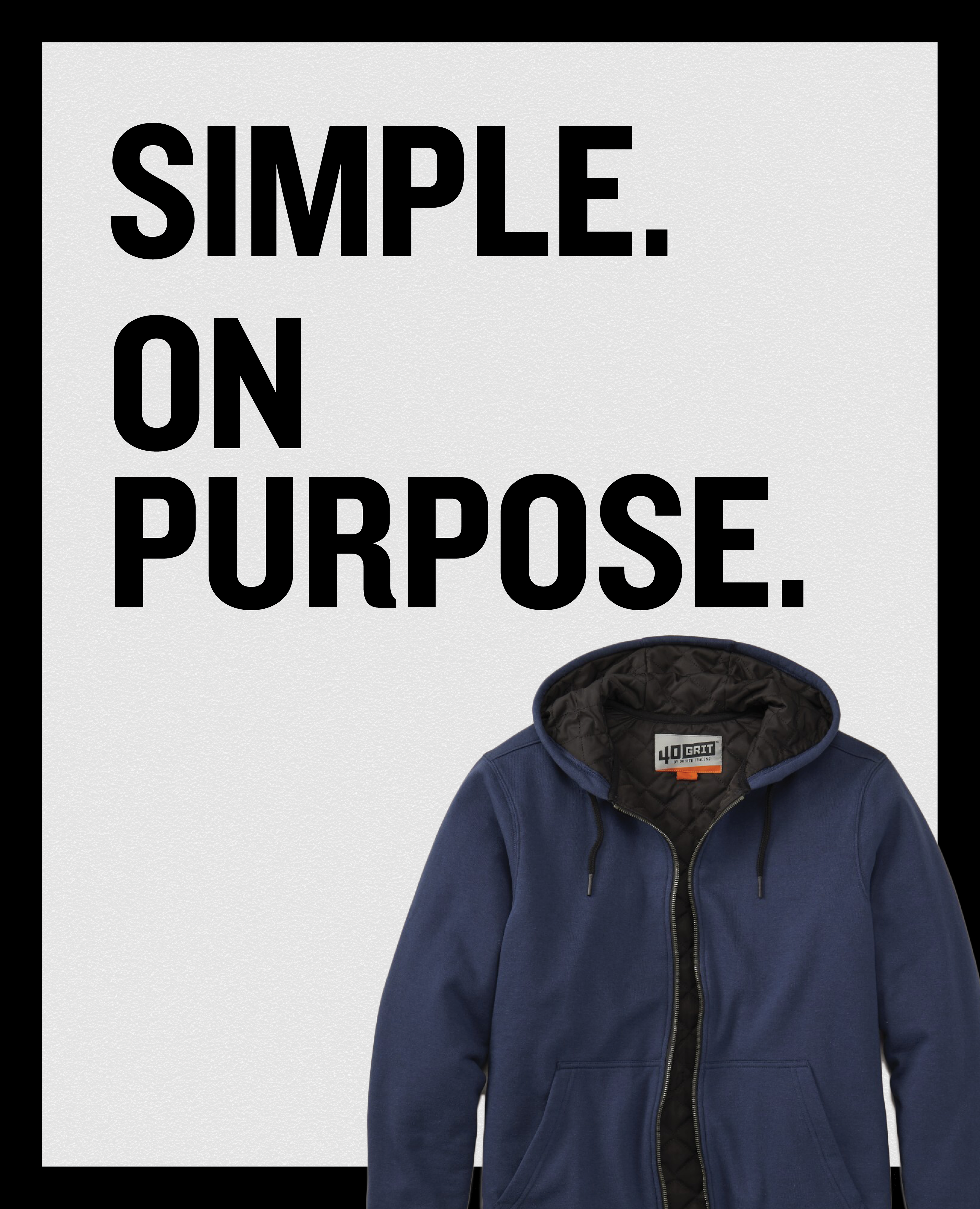
Retail Board

Brand Launch Retail Board
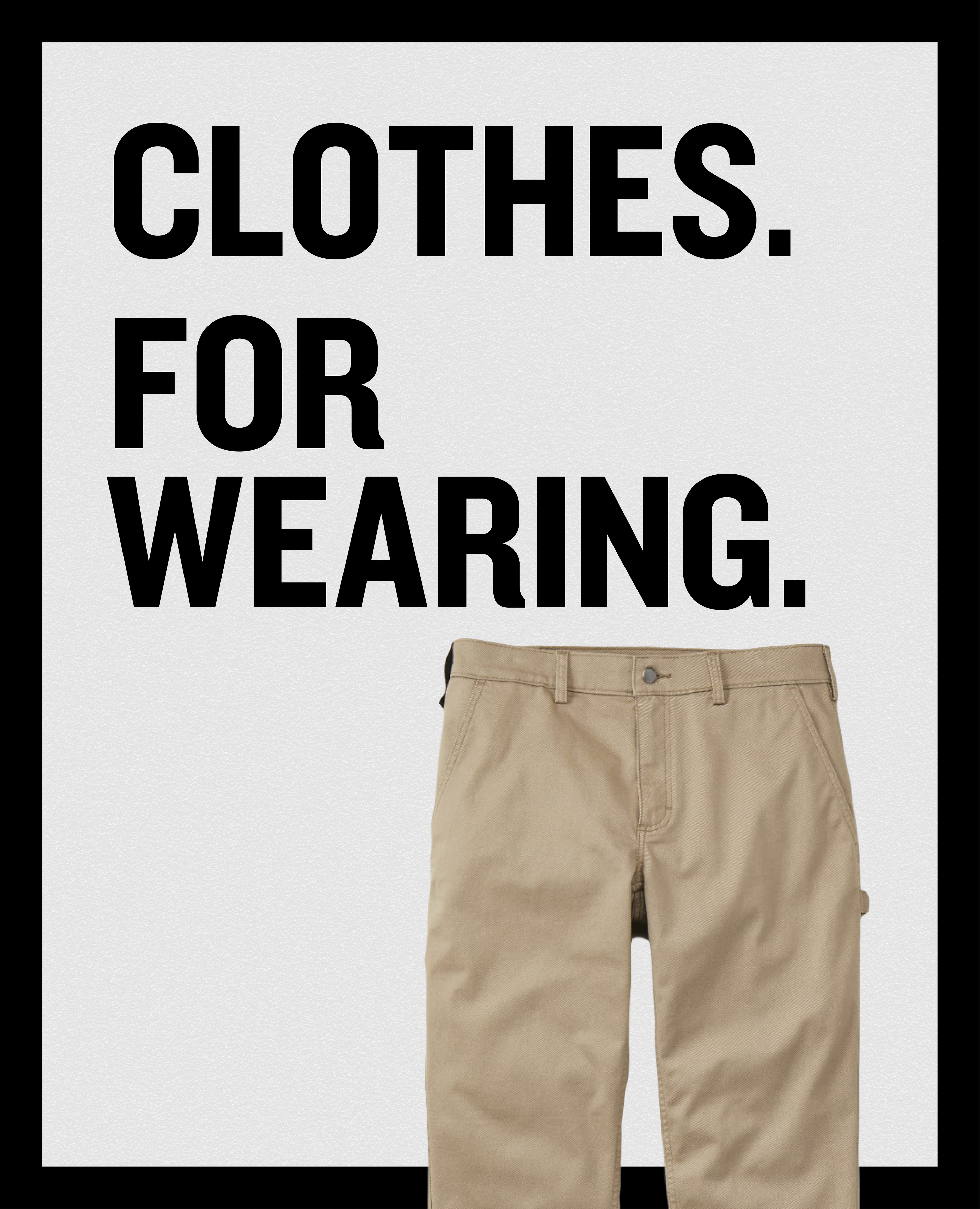
Retail Board
Catalog Spreads
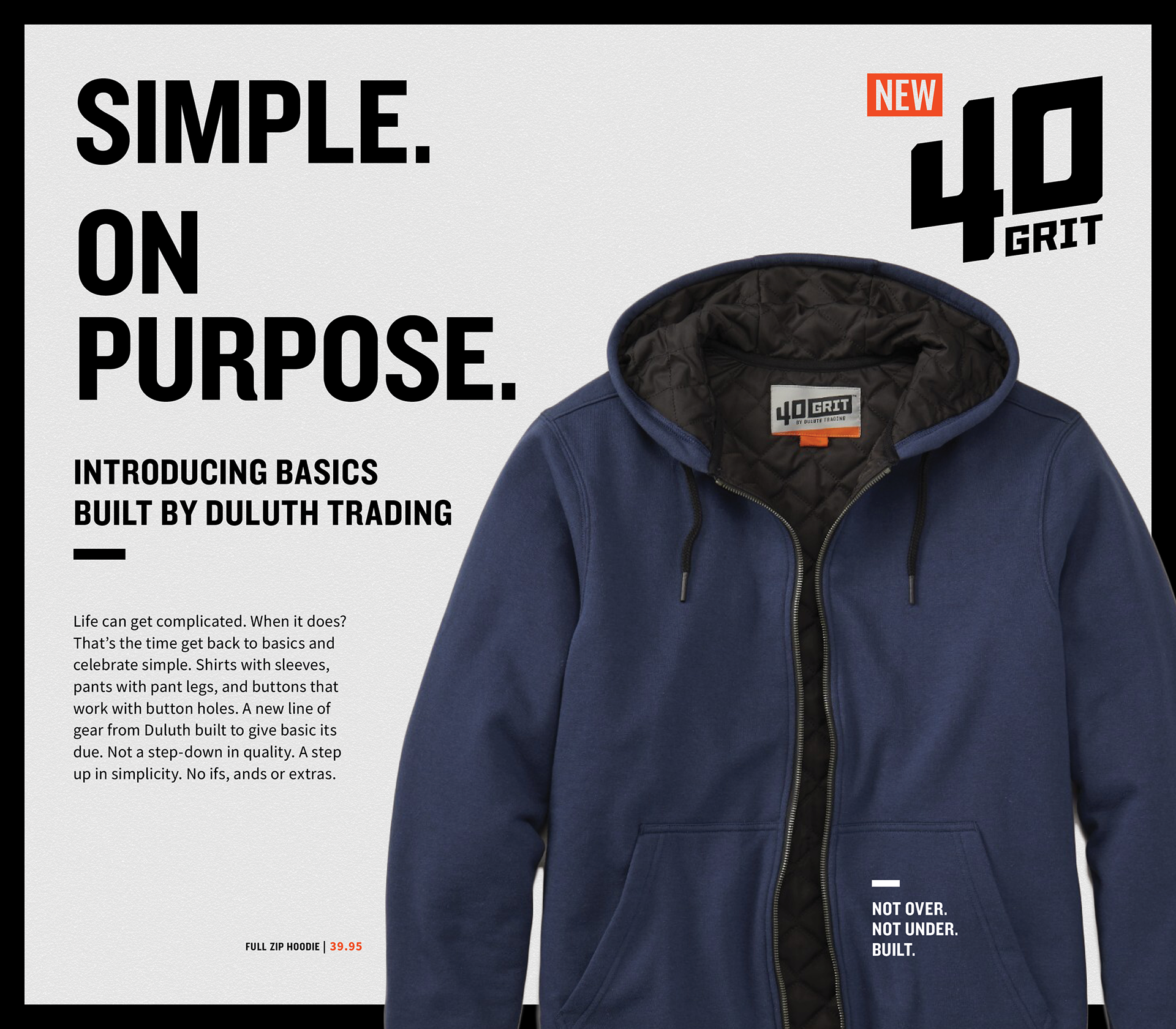
Catalog Spread 1-2
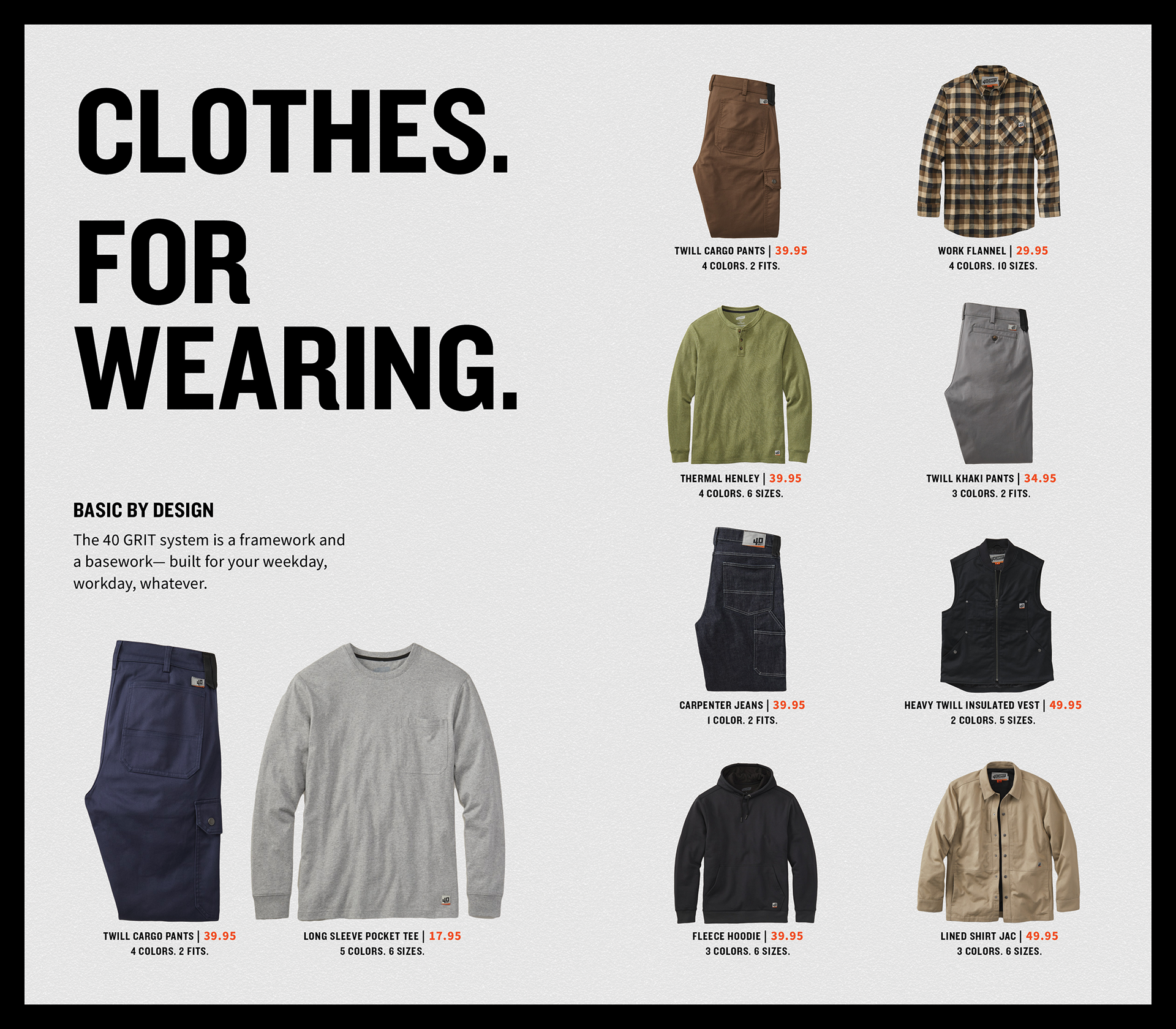
Catalog Spread 3-4
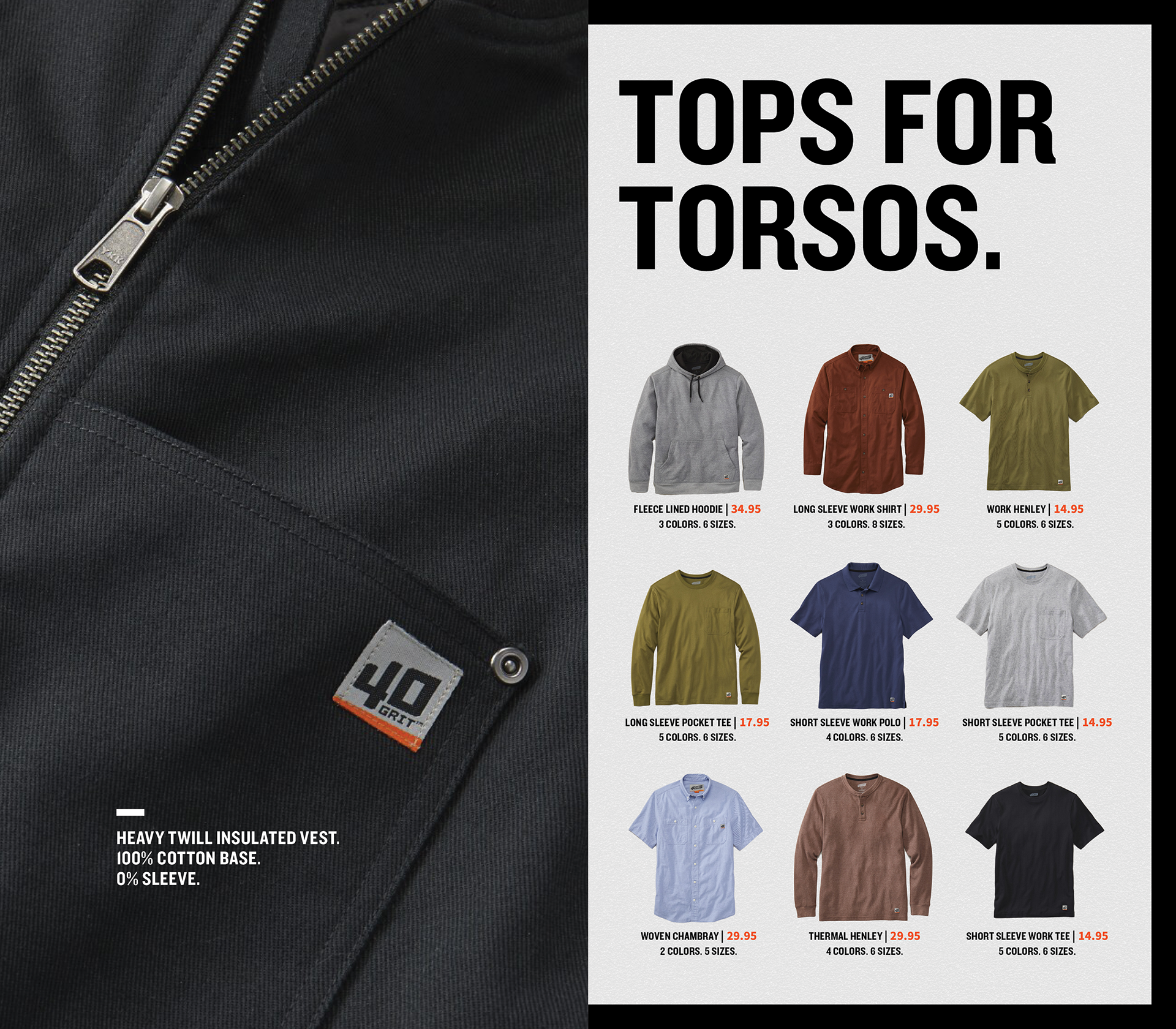
Catalog Spread 5-6
Categorical Instagram Carousel
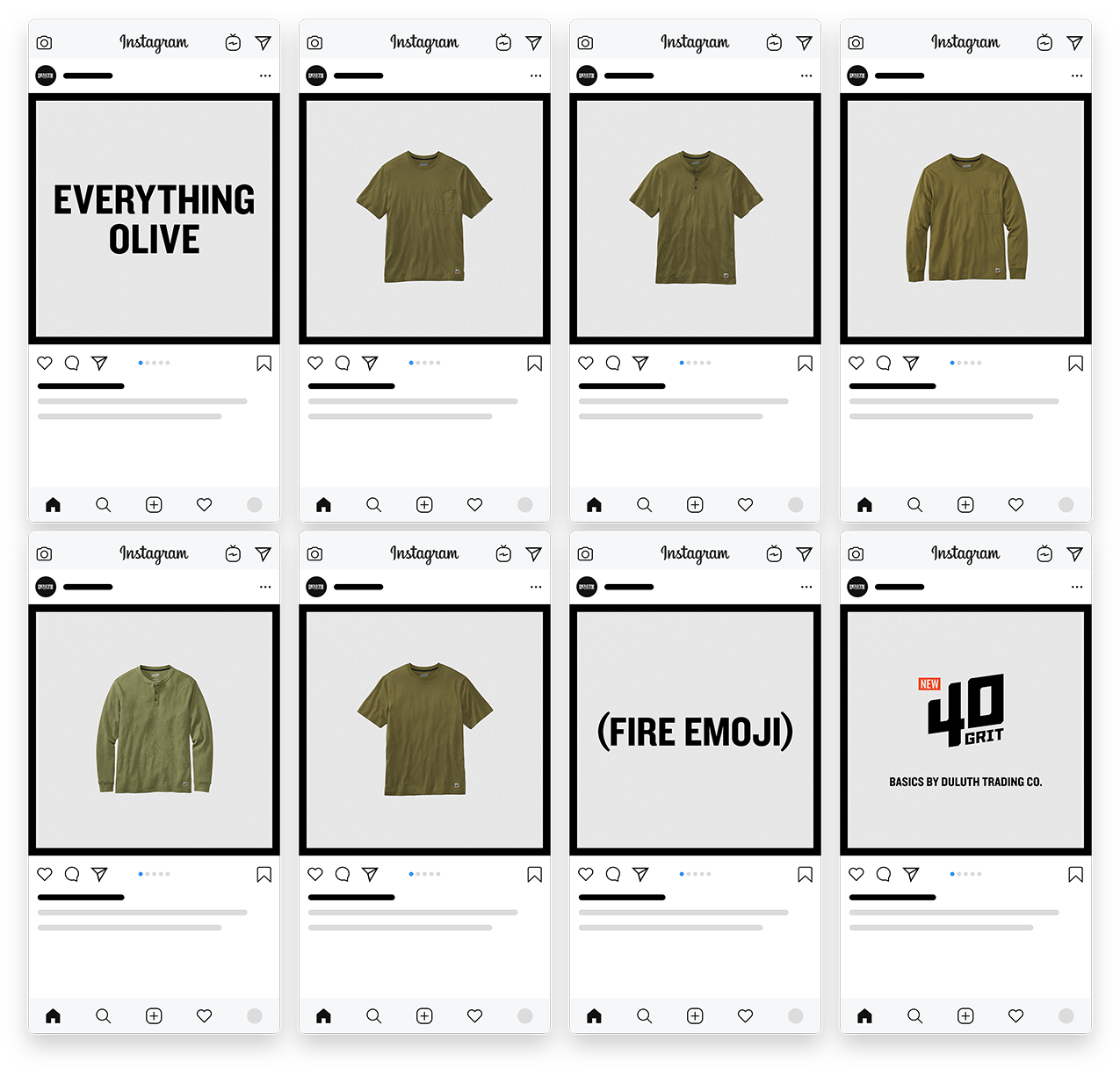
Macro Instagram Carousel

Youtube & Social Video Ads
_____________
INSPIRATION
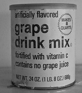
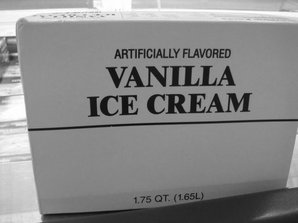
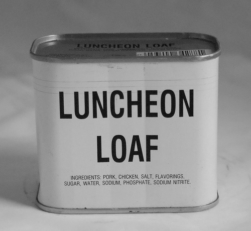
As a way to draw separation between the Duluth Master brand and 40 GRIT, we drew inspiration from the generic brands of the 80's. Their utilitarian nature and barebones aesthetic was the perfect launch pad for which the visual and copy direction took shape.

Designer: David Bramson | Design Intern: Dani Grimm | Art Director: Casey Christian
Creative Director: Brian Hucek | Copywriter: Patrick LaBelle | Motion: Dan Shickles
Executive Creative Director: Dana Lytle
Produced at Planet Propaganda
Creative Director: Brian Hucek | Copywriter: Patrick LaBelle | Motion: Dan Shickles
Executive Creative Director: Dana Lytle
Produced at Planet Propaganda